
The city of Sandy Springs has launched an interactive website of apartment complexes’ crime and fire safety data that includes a color-coded map of their relative crime rates.
Officials unveiling the “Apartment Safety Checker” at the Nov. 1 City Council meeting said it is a response to frequent questions from prospective tenants that the city previously couldn’t answer. But some councilmembers, while generally praising the effort, questioned whether the color-coding is confusing and amounts to a scarlet letter on some complexes even though they have fairly low crime rates.
Police Chief Kenneth DeSimone, introducing the Safety Checker, said that “one of the biggest questions we get…is how safe an apartment complex is.” The city call center gets those questions, too, said city communications director Sharon Kraun, though she could not offer an estimate of how many.
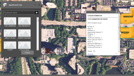
The “Safety Checker” site offers several types of data presented in different ways. On the map, all of the city’s apartment complexes are highlighted and a pop-up window provides recent statistics about major crimes there as well as disorderly conduct, loitering and prowling incidents. Police calls that do not result in criminal charges are not included. In addition, there is information about recent fires and whether the complex has sprinkler systems and on-site security.
The Safety Checker also calculates a form of crime rate—in terms of crimes per unit—and ranks all of the city’s complexes with it in two different ways. One ranking is a list on a web page of complexes from lowest to highest crime rates. The lowest are 0 crimes per unit and the highest is about 0.13.
Kraun said the crimes-per-unit statistic was calculated so the city is “equitable” in ranking apartment complexes of various sizes. However, city crime rates are usually calculated per person, not per housing unit, and the Safety Checker offers no direct comparison with the city’s overall crime rate.
Based on police crime stats and U.S. Census data, it can be roughly calculated that Sandy Springs’ crimes-per-unit rate—citywide and counting all types of housing and all categories of crime—is around 0.06, or 6 percent. The Safety Checker’s average crimes-per unit rate for the city’s 71 apartment complexes is around 0.04, or 4 percent. The median rate for the apartment complexes is 3.51 percent and the highest rate is 13 percent.
The Safety Checker’s other ranking method is color-coding the apartment complexes on the map by whether they are low, medium or high in crime ratings relative to the average for all complexes. Green indicates complexes in the lowest one-third; yellow is the middle one-third; and “magenta” (appearing red or orange to various viewers and devices) is the highest one-third.
“I assume you don’t want to live in a red apartment zone,” Mayor Rusty Paul said as the color system was presented.
But Councilmember John Paulson noted that the color-coding system is entirely relative. Even if all of the complexes had very low absolute crime rates, the top third would still get the warning-sign-style magenta color on the map.
“We’ll never have them all green, the way this is structured,” Paulson said.
Councilmember Gabriel Sterling agreed, noting that many of the complexes were currently listed with low rates. “This is a great starting point,” he said of the map, but suggested that some other system besides color-coding be used.
“We looked at just doing all of them with no colors,” Kraun said after the meeting, explaining that city staff concluded that a visual ranking of some sort was more useful. “If something is in the magenta color, it doesn’t necessarily mean it’s a bad complex,” she said.
Councilmember Andy Bauman spoke about the focus on apartments and some other interpretations of crime rates that the map suggests.
Bauman said that some residents have told him they would like to see similar maps for areas of single-family homes and retail developments. Many cities post some form of crime maps online, but they typically cover the entire city, not particular types of developments, instead being sorted by police patrol zones.
While the intent of the map is to inform tenants seeking an apartment, Bauman noted that not everyone can afford to freely shop around, saying, “Those are our residents who may not have a choice.” He said the map “begs the question” of how crimes can be reduced, not merely avoided, and how to “help them, both residents and complexes…get all of those into the green.”
DeSimone said the police already use crime incident data to determine where to focus police resources.
Kraun emphasized that the Safety Checker is just a start and that its features can be changed or expanded. The current plan is for the crime stats and ranking to be updated annually, unless there is some dramatic spike in crime in the meantime, she said. The Safety Checker site is available at sandyspringsga.gov/residents/resident-guide/your-home/renting/apartment-safety-checker.
So SS is tearing down single family homes to accommodate even more apartment complexes? Low to no tax generating property increasing school enrollment, pushing more traffic in to gridlocked streets and a greater burden on infrastructure. More apts/ cheaper rent/ more crime.