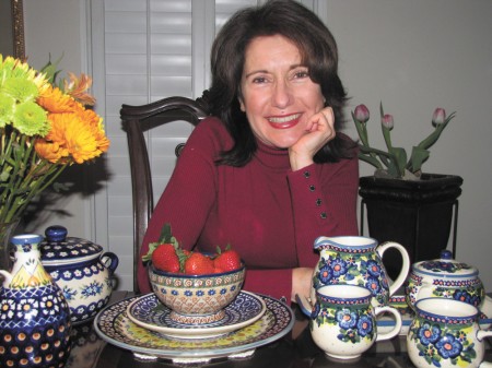
By Robin Jean Marie Conte
I think we can agree that in American society, our decades are defined by the color of their décor.
In the 1970s, homes were decorated in burnt orange and avocado green. In the 1980s, it was taupe and mauve. In the 1990s, I wasn’t paying attention and I have no idea what was supposed to be the “in” thing. I did, however, notice “shabby chic” start creeping into the pages of ladies’ magazines and onto the shelves of Target, and I do think that this particular style sensibility has paved the way to our current color void.
Because the defining colors of this decade, as far as I can determine, are gray and weathered…with white accents.
Come on, people! Can’t we do better than that? Why are we coloring our hair and lubricating our skin if we are going to decorate our homes in “gray” and “weathered”? So that we can look good in comparison?
Don’t believe me? Go ahead — check a bridal registry, any bridal registry. All the dishes on offer are white — and not just shades of white, mind you, but pure white. The variety comes in the shapes. You might have square white dishes, round white dishes, curvy white dishes; you will have nuances of shapes that will challenge your powers of discernment. But all the dishes will be white.
I’m telling you, folks, plain is in. White is the new Wedgewood. At the same time, Riedel is the new Waterford. The blander, the better.
Still not convinced? Walk into a Restoration Hardware (but don’t wear fuchsia — you’ll probably be kicked out). I’ve seen more color in a game of “Battleship.” The store’s color palate for upholstery ranges from light neutral to dark neutral. You can choose between “sand” and “fog” for your wingbacks…and you can stray as far as “mocha.”
There might be an item — a pillow, perhaps — that once contained color, but it has been stripped of it so as to look stylishly dull. Thus, the pillows in the store that I used to covet due to their singular ability to lend festive splashes of color to my solid leather sofa have all been covered in burlap sacks. (But they have French words on them! And, yes, that costs extra.)
Flowers are dried, furniture is distressed, linens are faded, and they all come that way when you buy them. The more worn-out it looks, the more in it is.
But I happen to like a bit of fresh color. Am I the only one left who does? Unpretentiously bold orange pumpkins, festive red ribbons tied onto evergreen garland, cheery yellow sunflowers — I think that they all serve to brighten our lives. So how is it, that color has become unfashionable? Why do we only go for the vivid blues and reds when they’re enameled onto a $350 cast iron pot?
I’m a bit unconventional, and I’ve always been about two steps behind the current fashion trends, anyway. Come over to my house for lunch, and you will be served on rebelliously multicolored dishes. Because I do think that if we’re honest with ourselves, we know that we can manage to use color and be tasteful at the same time.
So be daring, be flamboyant, be intense…pull out that old, violently patterned throw you’ve been hiding in the basement and slap it right down onto your beige sofa.
I won’t judge you.
Robin Jean Marie Conte is a writer and mother of four who lives in Dunwoody. She can be contacted at robinjm@earthlink.net.

Comments are closed.